Under Maintenance
We deeply apologize for interrupting your reading but Vendetta is currently undergoing some important maintenance! You may experience some layout shifts, slow loading times and dififculties in navigating.
When the Texas Rangers debuted their City Connect uniforms this past Friday, it marked the 16th version that Major League Baseball is rolling out. While I applaud every team for coming up with a new uniform, some of these city-inspired uniforms are better than others.
Today, I’ll be ranking all 16 released uniforms. Let’s get into the totally unbiased rankings!
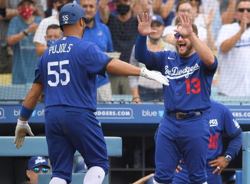
I like the idea that the Dodgers were going for here, but it was executed so poorly. The “Los Dodgers” across the chest is in honor of Fernando Valenzuela, and his impact on the Latin American community. That’s the best part of these uniforms.
The blue pants are simply awful. I understand that the red numbers are their thing, but they could have changed it up on these jerseys. Variety is what City Connect uniforms are for. A white number would have looked much better. Fans also hated these, so much so that they ditched the blue pants for this year. They get plus points for that, but I will never forget the original Smurf-like uniforms.
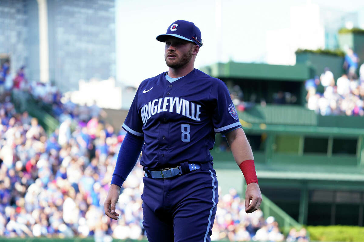
Chicago’s City Connect uniforms are inspired by the 77 neighborhoods of Chicago. They then contradict themselves by sticking “Wrigleyville” on the front of their jerseys. I don’t like the deep blue and teal, as the two colors don’t complement each other.
These got leaked before they officially debuted in 2021, and fans hated them when they came out. The hats are sort of cool, but these are easily amongst the worst of the uniforms that I’ll review on this list. They don’t make me think of the Cubbies at all!
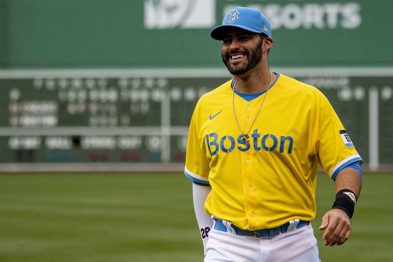
Just, no. Look, I get that there is an awesome story behind these celebrating the Boston Marathon and Boston’s Patriots Day. Also, props for thinking outside the box. Those are the only reasons that these abominations aren’t dead last on this list.
Call me a traditionalist, but when the Boston RED Sox come out onto the field, I am not expecting to see yellow and blue everywhere. They could have come up with just about anything else. I’m still shocked that these got approved. But hey, the Red Sox are 17-4 in these uniforms, so who am I to talk?
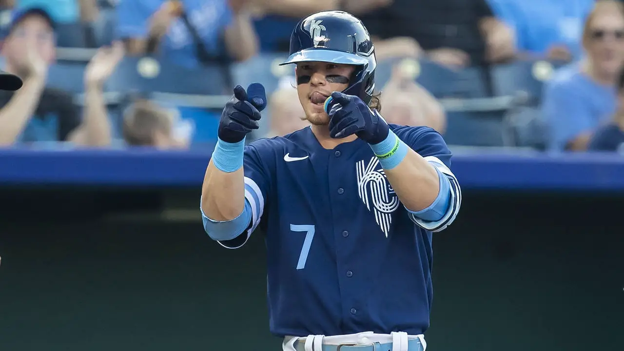
Someone help, I’m going to fall asleep. These Royals City Connect uniforms are so boring. The preface of these is to honor the past Kansas City baseball teams with the dark blue color. They chose the dark blue as the primary color instead of the much more appealing Carolina blue. The fountain inspired logo is just okay. These leave me imagining what could have been.
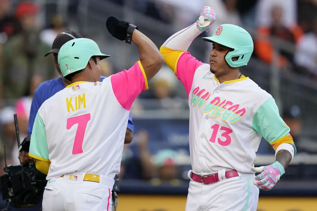
When the Padres City Connect uniforms were released, I thought they could have been mocked up by a three-year-old who just discovered crayons. Green, yellow and pink on a white canvas doesn’t look good. What I like about these uniforms is that they unite Mexico, SoCal and the Pacific Ocean. If that’s your reasoning for wearing these, then why those colors? Could have been executed much better. They get points because they aren’t boring, at least.
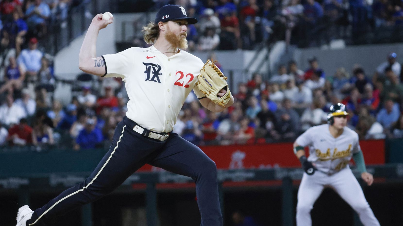
Texas unveiled their unifroms most recently, and they honor Texas’ independence, along with the cities of Dallas, Fort Worth and Arlington. The jerseys and the logo are cool on these ones. Those parts of the uniform the are very clean. The big “TX” with the Eagle is a nice touch.
What spurns me away is the dark blue, borderline black pants. They just don’t mesh well with the unforms. If you wanted to include the dark blue, make that the jersey color and make the pants the cream color. For now, these are just … meh.
 fits pumps first base coach Alyssa Nakken after he walked in the fourth inning of a MLB game at Oracle Park in San Francisco, Calif., on Tuesday, April 12, 2022. It is Nakken's first on field appearance by a woman in MLB history. (Ray Chavez/Bay Area News Group)")
The Giants should have left these ones on the drawing board. They look pretty crisp, but the graident from orange to white is just ugly. Apparently they did the gradient to represent the fog? That’s certainly bizarre. That’s like the Mariners honoring rain because it rains a lot in Seattle.
These aren’t overly terrible, just not very good. They get points for the Golden Gate bridge on the sleeve.
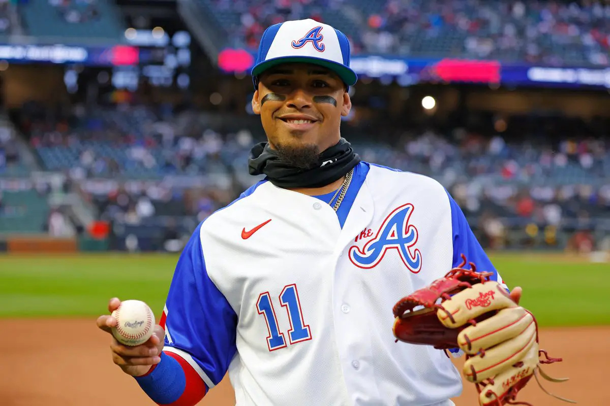
These are cool. The Braves unveiled these uniforms in honor of Hank Aaron’s home run chase in the early 1970s. There is one major flaw with these uniforms, and that is that the Braves already have uniforms that look just like these! For that reason, fans didn’t love them. Also, the hats look like Spring Training hats. They were so close to cracking the top five, but lack of creativity drops them a few spots.
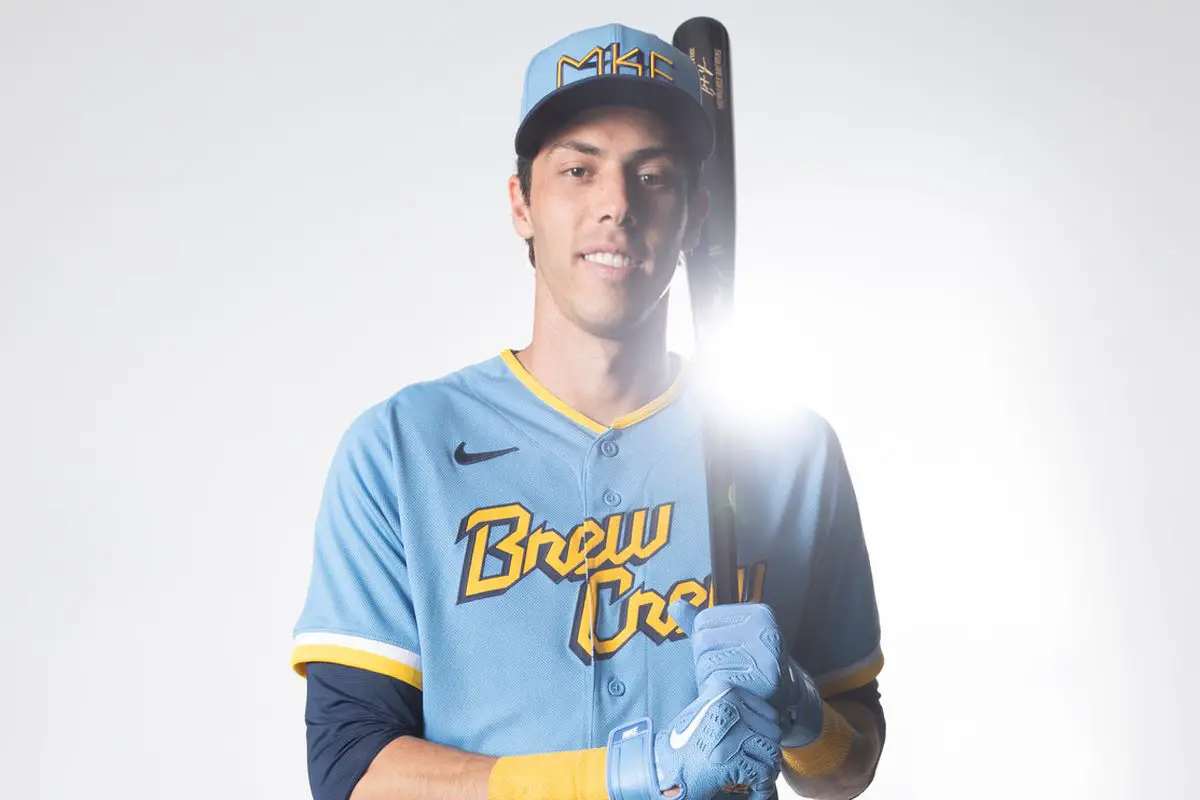
I love the “Brew Crew” across the chest of these Milwaukee uniforms. The inspiration for these comes from the Milwaukee flag, which is sort of weak in my opinion. They gain points because I’m a sucker for the Carolina blue. The points off comes from the “MKE” on the hat and batting helmets, which could have been done much better. The style is awesome though.
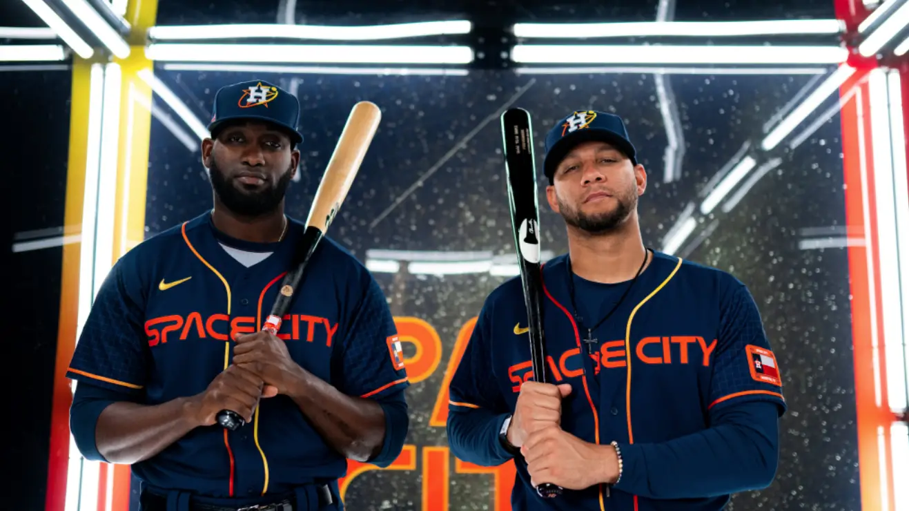
“Space City” is a risky thing to put on the center of your jerseys, but the Astros made it work. Of course, these come from NASA being based in Houston. The jerseys are cool and I like the colorway a lot. What makes these uniforms great however is the hats. Houston should consider making that logo their primary. Points off for blue pants. So close to being in the top three on this list.
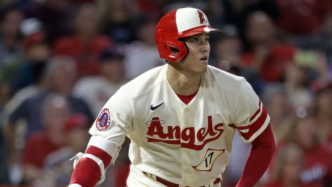
The Angels’ City Connect uniforms represent Orange County’s surf culture. The cream base color is clean, and I like how the pants match. The script “Angels” is inflated like a balloon, to represent surf companies. That’s where they get points off. Not the best, but overall, a very aesthetically pleasing uniform.
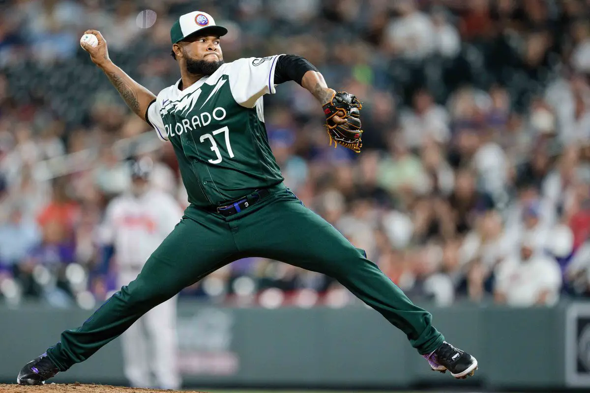
Don’t get me wrong, I like these Rockies City Connect uniforms. The Rocky Mountains on the top of the jerseys are cool. The deep forest green is a great homage to the variety of Colorado.
However, I’m not all over these uniforms like some people are. The hats are borderline bad, even though they have a cool message, representing the soil and sunshine. At the end of the day, that’s what dropped them out of the top three.
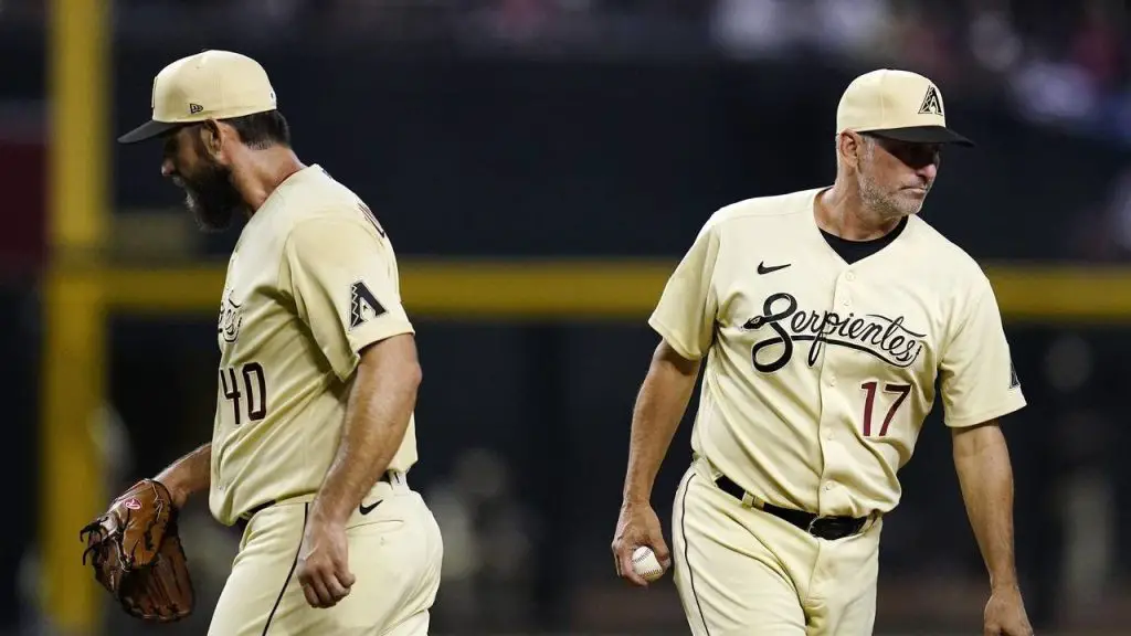
I really dig these Diamondbacks uniforms. They represent the Hispanic community in Arizona with “Serpientes” across the chest. They aren’t as yellow as they seem, but instead more of a sand color to represent the desert. The black and sand hat might be the best hat on this list. The Arizona flag on the arms are also very appealing. The red numbers actually work with these, unlike the Dodgers. These almost cracked the top three.
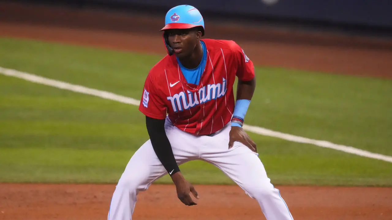
These Marlins City Connect uniforms just work well. They pay tribute to the Sugar Kings, a Triple-A affiliate of the Reds who played in Cuba. An awesome backstory paired with two awesome colors makes these mesh together very well. I was suspicious about the uniforms, but they ended up looking great on the field.
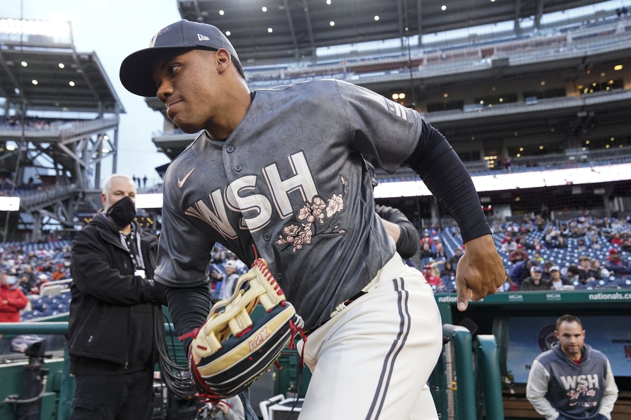
Wow, I was blown away when the Nationals released these City Connect jerseys. The gray works so well with the Cherry Blossoms, inspired by the signature tree of the city. The cream pants work with the gray and pink. The jerseys have a hidden flower accent on them as well, which I can really get behind. These were so close to being No. 1, but I’m not a huge fan of “WSH” across the chest.
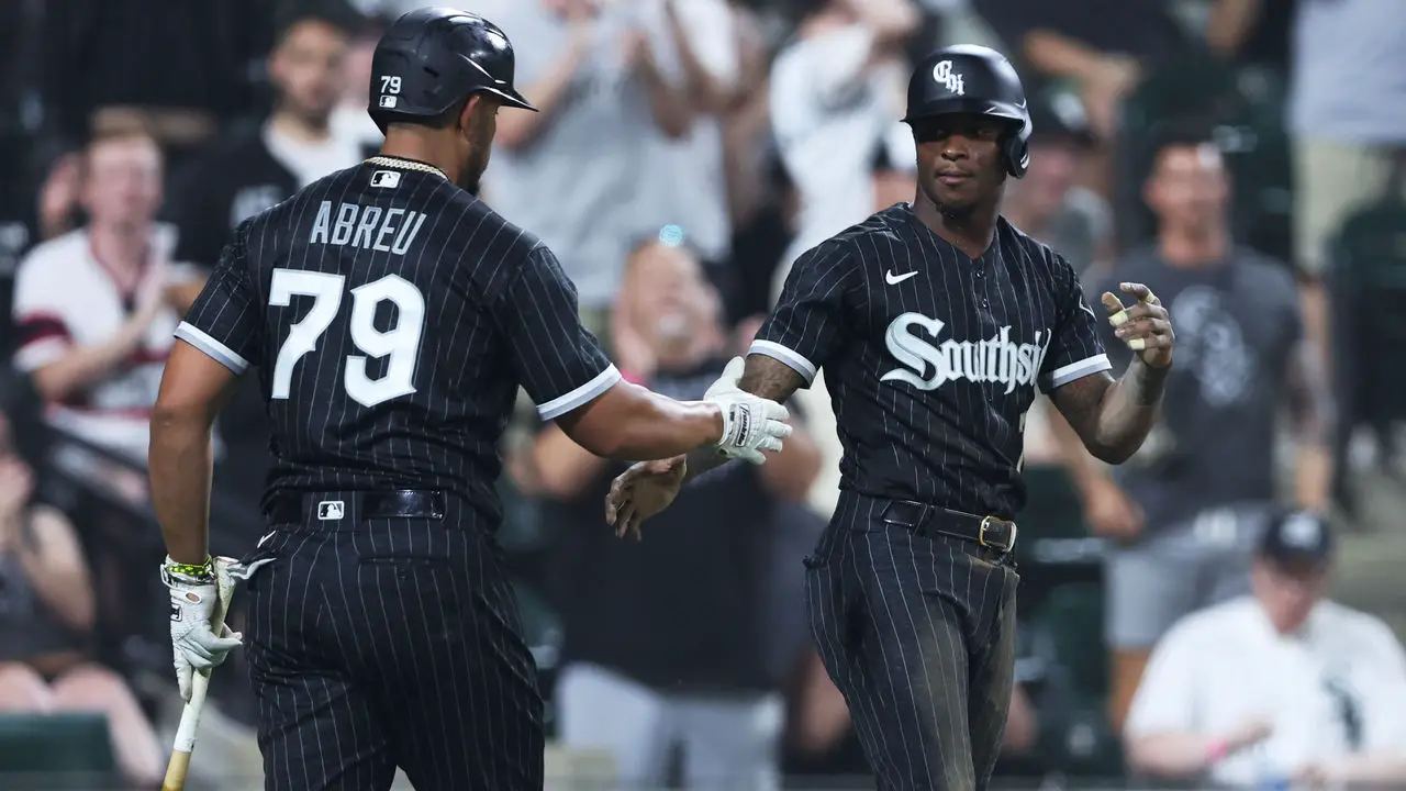
These are the gold standard of City Connect MLB jerseys. The numbers on the back look amazing. The best part of these is the all black background with the scripted letters “Southside” on the front. They are gritty, mean and represent what the Sox wish they were. There is just enough gray to not be overused. Well done, White Sox.
The City Connect series is an awesome series that can be done very well, or very poorly. There are still others to be released this season, like the Orioles in May and the Pirates in June amongst others. I hope all 30 MLB teams can come up with a City Connect jersey at some point. Props to the White Sox and Nationals. As for the teams near the bottom of the list, scrap your City Connects and come up with better ones.
***
Subscribe to Vendetta’s Twitch
Click here for more MLB content
Subscribe to Vendetta’s YouTube
The Leafs 100% Traded Ryan Reaves Because He Defended Mitch Marner The Maple Leafs and Sharks agreed to a minor trade yesterday. One that included Ryan Reaves heading to San…
Jeff Marek Plants Stinky Rasmus Andersson Dallas Destination Rumor I guess this is a continuation of the post I just wrote on Jeff Marek. Sorry, not sorry, but what he…

SoxProspects: Proudly Begging for Donations Since 2003; Still Too Scared to Talk to Me “Be curious, not judgmental” – Ted Lasso. That show, Ted Lasso, just brings so many life…
(202)
(29)
(1616)
(518)
(957)
(180)
(196)
(999)
(2952)
(4485)
(8605)
(2204)
(2170)
(25)
(797)
(1193)
(1175)
(1022)
(1228)
(28)
(327)