Under Maintenance
We deeply apologize for interrupting your reading but Vendetta is currently undergoing some important maintenance! You may experience some layout shifts, slow loading times and dififculties in navigating.
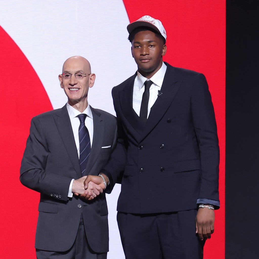
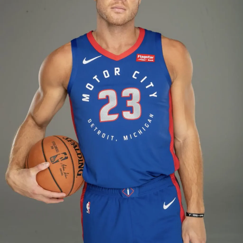
Last week, 29 NBA teams revealed new City Edition jerseys. I’m here to give my unwarranted opinion and rank them from the worst to the best.
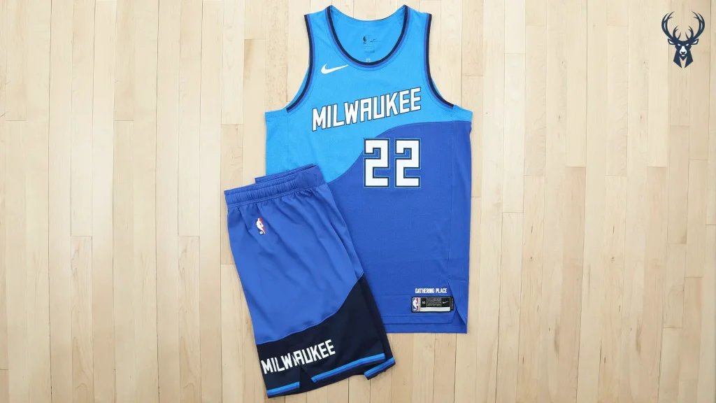
This is just really boring to me. It’s described as “paying homage to Milwaukee being a meeting place by the water” but I just think there’s a lot more that could have been done. It’s not necessarily ugly…it’s just very…meh.
3/10
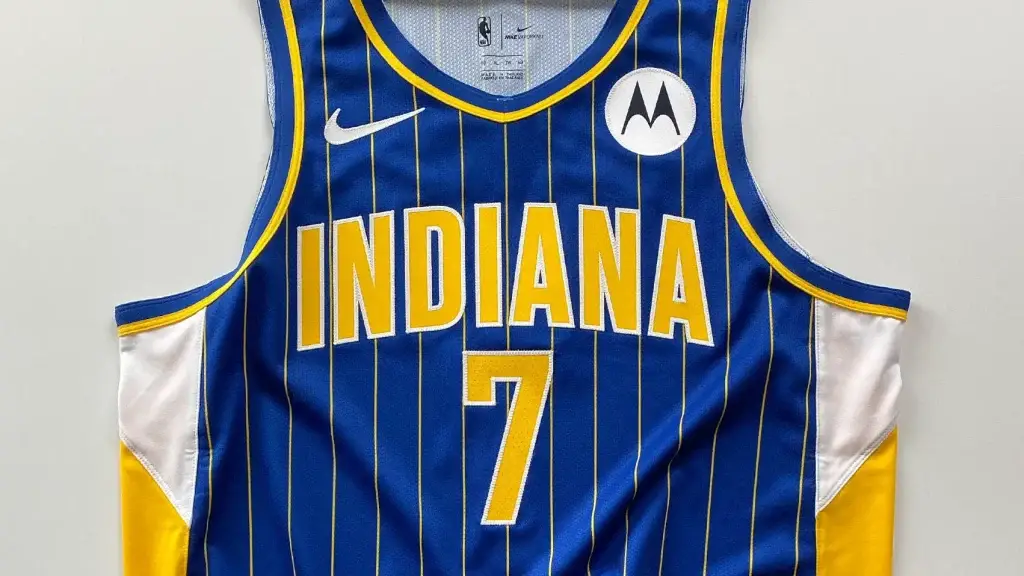
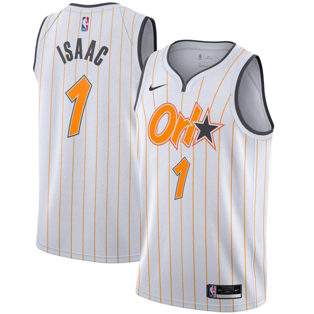
This? This one is ugly. I understand the tradition and the stripes and whatever. But that doesn’t change the fact that it is uh-gl-ay
4/10
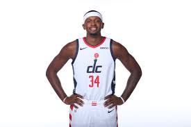
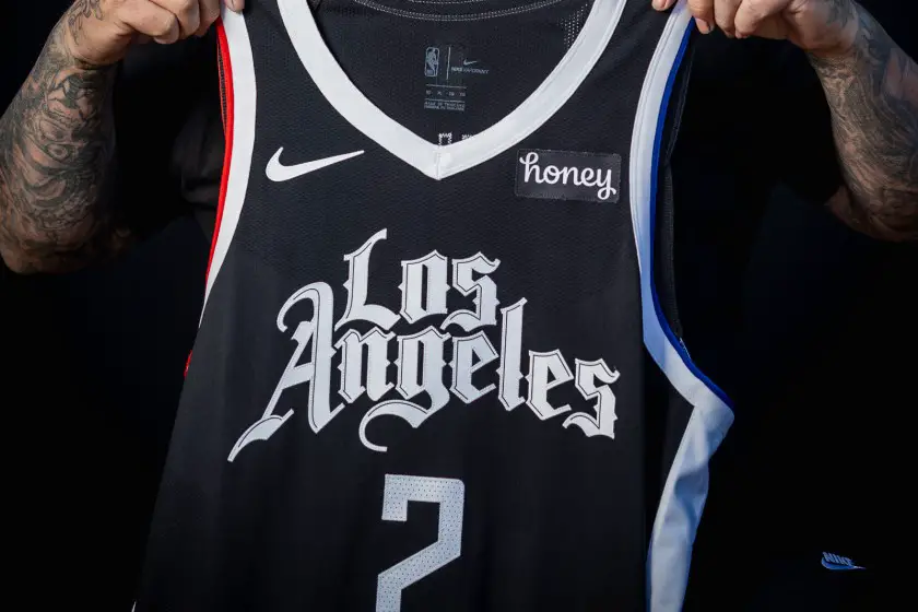
I am willingly going to wear a whole arm and hand on my chest. Yes. Of course. Makes wonderful sense. It’s called fashoon.
?/10
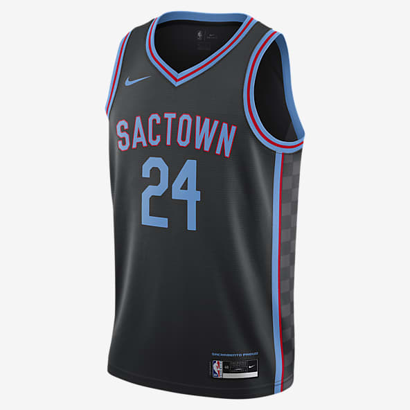
No.
3/10
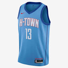
Looks like the Pacers jersey. Not a huge fan. Repetitive.
5/10
I don’t like the two-toned blue. It feels very “second grade in 2006”. I would know. I was in second grade in 2006. Anyways, pick one shade, please.
5/10
I don’t hate it. I don’t love it. Black and white is very classic. Neutral opinion.
5/10
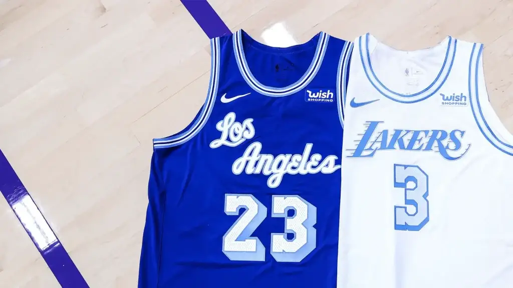
I like the colors I guess but I think purple and yellow is so ingrained in the LA culture that it shouldn’t really be touched.
6/10
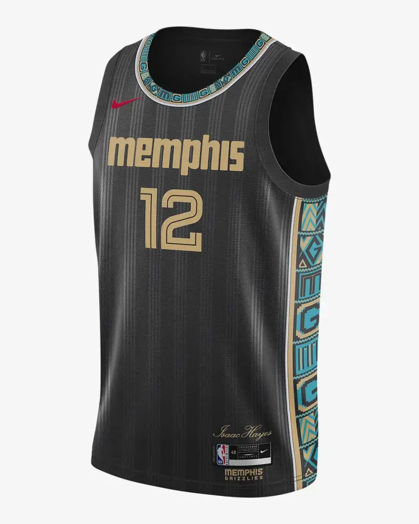
I don’t really have an opinion. I like the teal color in contrast with the black.
6/10
I think it would look better in black and gold rather than white.
6/10
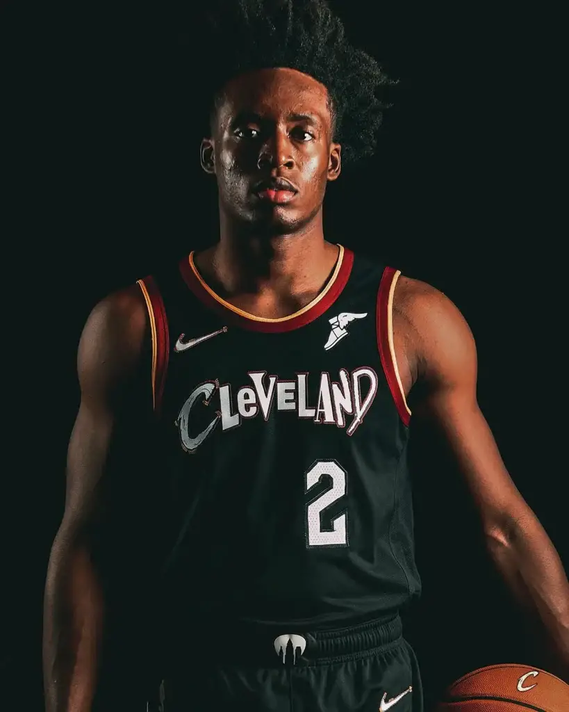
What’s different? What is this font? No thanks.
6.5/10
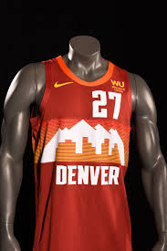
I really like this. I do. The only thing I have an issue with is that they called it “flat irons” red. It’s clearly Red Rocks red. C’mon man. You had one job.
7.995/10
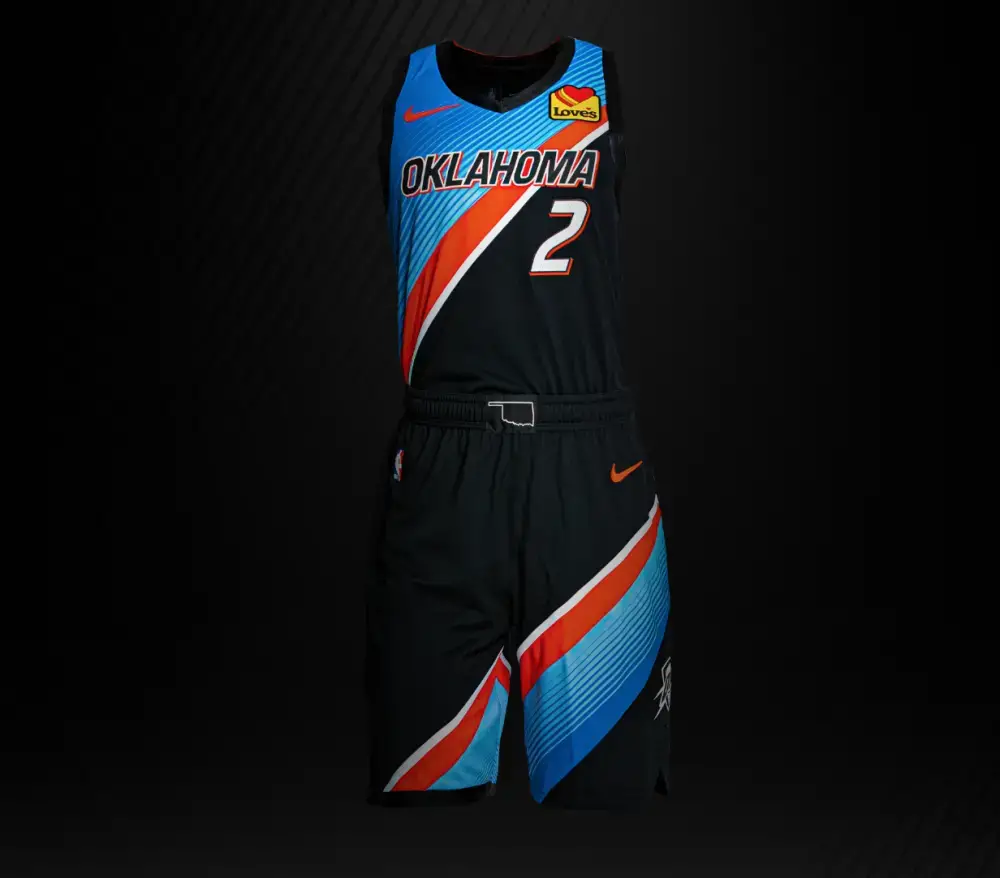
I like the diagonal colors but I don’t vibe with that shade of orange.
7/10
Fantastic. Love it. Classic.
8/10
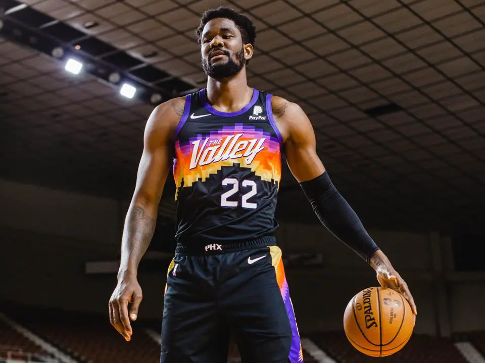
It’s pretty. I like it. Orange is okay here. Sunset. Very good. Very nice.
8/10
It’s black and white. Take a guess.
8/10
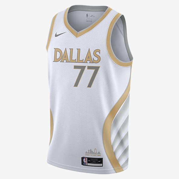
This is what the Mavs should have done. Can’t go wrong with black and gold.
8/10
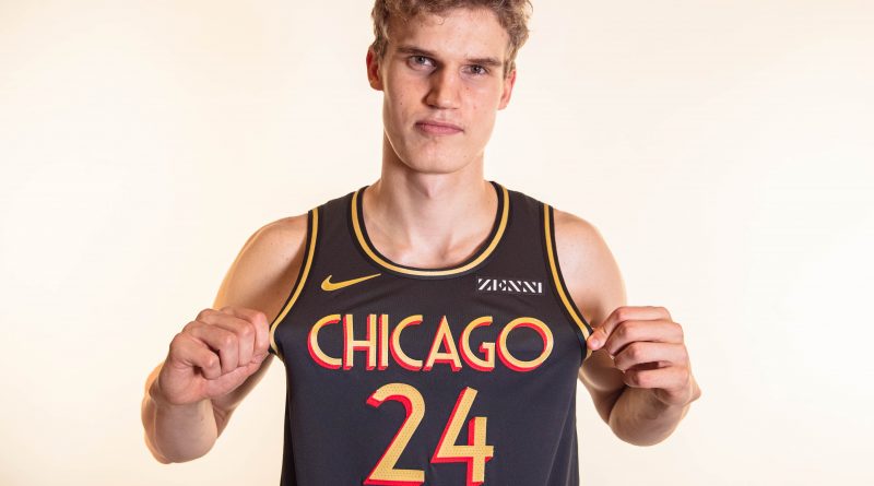
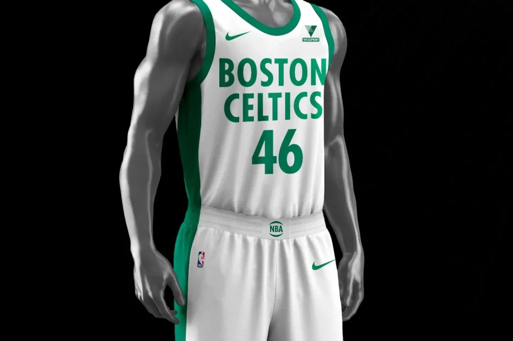
It’s very similar to last years uniforms but not as…loud. Neutral opinion. Any higher would be a stretch but any lower would just be rude.
8.5/10
Yes. 100x yes. Love it.
9/10
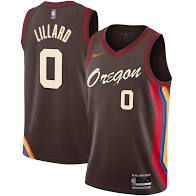
I asked for this for Christmas and could not tell you a single thing about the Blazers.
9.5/10
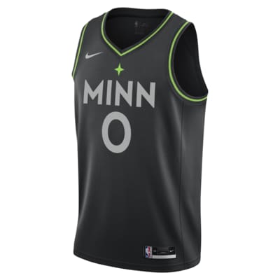
I love the colors and the contrast. Clean. Icy.
9/10
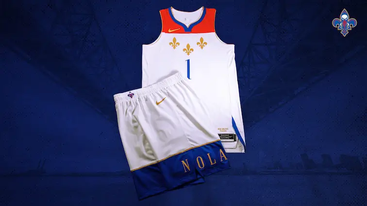
I don’t have a super strong opinion. I just really like the fleur de lis
8/10
Classic uniform for a classic team.
9/10
I love this. It’s clean. The colors work well together. There’s enough happening but it’s not too busy.
9/10
I mess with it. I do. I might catch some heat for that but I am a fan.
9/10
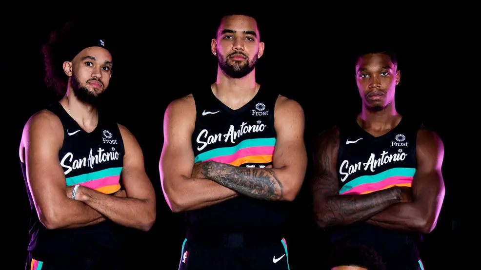
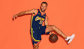
I just really like this mint color. I painted my nails this color every three weeks for two years straight in middle school.
9/10
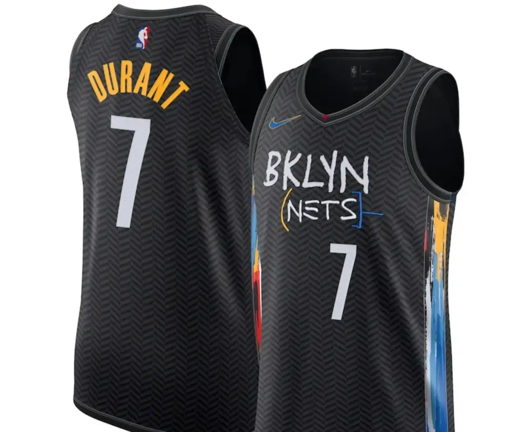
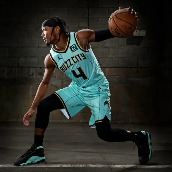
I love this for no good reason other than it’s unique and not in a bad way. It matches the style and culture of Brooklyn, New York. Now, please sign The Beard. Thank you.
9/10
Absolutely.
10/10
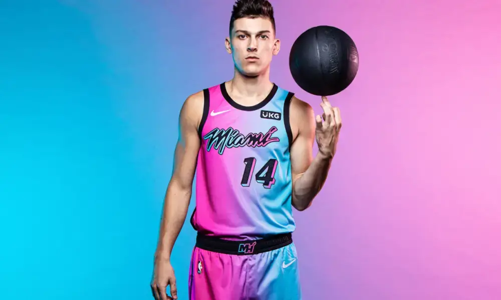
YES. This is so loud and wild and crazy and matches the culture around Miami Florida so well. Bam and Jimmy and Tyler. Miami HEAT
10/10
Check us out on Instagram!!
Grab a shirt while you’re here!
The Sports Media Revolution Has Begun. Vendetta Will Win It. Happy Independence Day. Today is a holiday because a group of courageous people had the stones to stand up for…
Hurricanes Win The Nikolaj Ehlers Sweepstakes Nikolaj Ehlers has picked his next destination. After spending the last ten years in Winnipeg, Ehlers is on the move. Instead of sticking around…
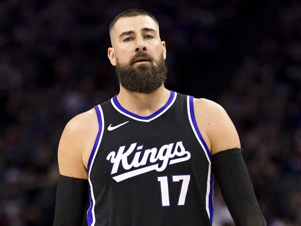
Report: Jonas Valanciunas is ‘considering’ leaving the NBA for EuroLeague On Tuesday, the Denver Nuggets acquired backup big man Jonas Valanciunas from the Sacramento Kings in exchange for Dario Saric,…
(202)
(29)
(1610)
(518)
(955)
(179)
(194)
(997)
(2942)
(4467)
(8600)
(2203)
(2153)
(25)
(796)
(1193)
(1174)
(1022)
(1225)
(28)
(327)