Under Maintenance
We deeply apologize for interrupting your reading but Vendetta is currently undergoing some important maintenance! You may experience some layout shifts, slow loading times and dififculties in navigating.
Nearly every year we see new jerseys released across all major sports. The National Hockey League (NHL) has had some great jerseys in the past as well as some very questionable decisions. Last season, a new series of NHL jerseys were introduced to the league in the form of the ‘Reverse Retro’ jersey. The combination of previous jersey designs and modern colors was a hit with great-looking jerseys from the Colorado Avalanche, LA Kings, and Carolina Hurricanes amongst others. For the current season, a few teams introduced new jersey designs. The New Jersey Devils added a new black jersey with the word “Jersey” written across the front in white with a red trim and the Winnipeg Jets brought back the jerseys worn by the original Winnipeg Jets before moving to Arizona. Plus we saw a brand new set of jerseys released for the NHL’s newest team the Seattle Kraken. The Kraken’s jerseys are some of the nicest looking in the league but have a very modernized look.
Starting to look ahead to next season, rumors swirled over the weekend surrounding the possible revival of an old jersey for the Buffalo Sabres as an image that has since been deleted showed the ‘Goat Head’ jersey that they wore from 1996-2006. This got me thinking, what are some other great NHL jerseys from the past that should also be brought back that were not included in last season’s ‘Reverse Retros’. It also had me thinking about some current NHL jerseys that teams should throw in a dumpster and light on fire.
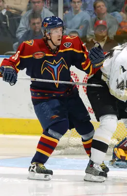
10. Atlanta Thrashers 1999-2003 Away
The most recent NHL team to relocate was the Atlanta Thrashers, now the Winnipeg Jets. This jersey would be a great one to bring back and the Jets could easily turn the logo on the front of the Thrashers jersey into their own jet logo as it already looks like a flying bird. What stands out the most on this jersey is that the secondary logo looks great in a “T” shape. With the secondary logo on the front of the jersey, it is interesting to see what was the Thrashers’ primary logo appear on the shoulder.
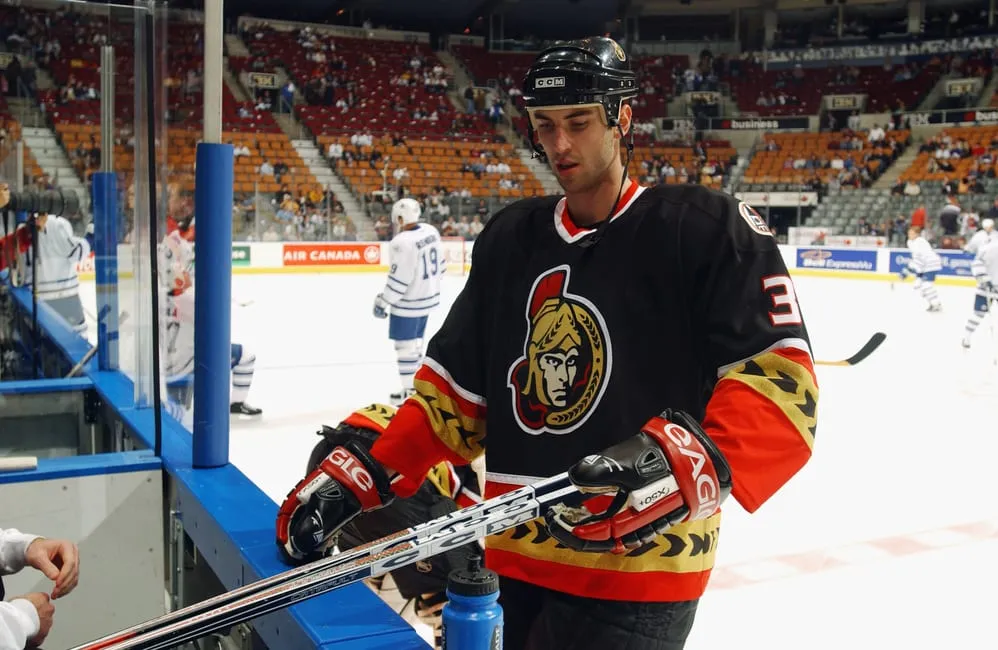
9. Ottawa Senators 2000-2007 Third
For starters, I think this is one of the better color combos in the NHL with a black jersey and red and yellow trimming. The yellow stripe with black arrows that is on the arms and bottom part of the jersey reminds me somewhat of the trim that is on the Arizona Coyotes ‘Kachina’ jerseys. The logo with the Senator facing forwards is a better look than the sideways facing logo. However, on this jersey that is the one area that could be improved as the eyes on the Senator look crazy compared to other logos on the Senators’ jerseys.
8. Vancouver Canucks 1989-97 Away
A similar color scheme to that of the Senators jersey above, the Canucks stick with the red, yellow, and black that had been around since the introduction of the very bad “V’s” jersey. With this away jersey the Canucks finally got away from the use of “V’s” and moved to straighter less bold lines. On the front of the jersey was an ice skate with the word “Canucks” being in the place of the skate blade. These jerseys were fan favorites and were brought back for a few games during the Canucks 50th Anniversary season in 2019-20 because of a fan vote.
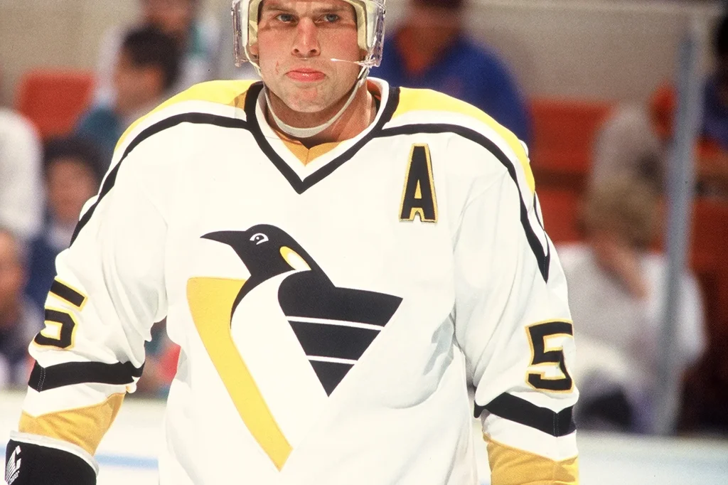
7. Pittsburgh Penguins 1992-95 Home
Following the second of back-to-back Stanley Cup Championships, the Pittsburgh Penguins introduced the ‘Robo-Penguin’ jersey. Some of the NHL’s best players played in this jersey in Jaromir Jagr and Mario Lemieux. This jersey would be one that a current great duo of Sidney Crosby and Evgeni Malkin would be proud to wear. The slicked-back penguin was a change from the skating penguin that has now returned. The whole uniform just looks nice and clean with a good pattern down the arms and shoulders.
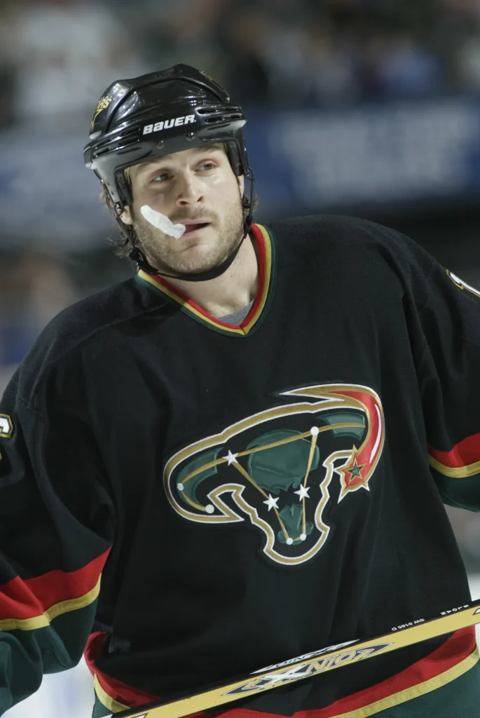
6. Dallas Stars 2003-06 Third
A reintroduction of a primarily black jersey happened for the Stars following a three-year hiatus. The general design of the jersey is good and the red and green stand out from the black. However, there could have been something done with the logo to make that better. I like the idea of using a bull on the shirt as a nod to Dallas’ history, but the use of the stars to form a constellation somewhat turned a mean-looking bull into something completely different, hence the jersey’s nickname the ‘Mooterus’. By just removing the lines and dots this jersey could have been one of the all-time greats.
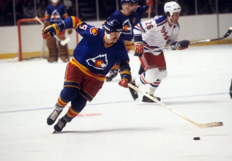
5. Colorado Rockies 1976-82 Away
As the first professional Colorado hockey team, the Rockies had the chance to embrace the colors of the state flag and they sure did. The red, yellow, and blue of the Colorado flag are very prominent in the only away jersey in Rockies history. The use of the mountains is extremely representative of the Rocky Mountains which are a major part of life in Colorado. This mountain style is similar to what can be seen on the current Colorado Avalanche alternate jersey. I’d be very excited to see these return especially if worn next time the New Jersey Devils play in Denver.
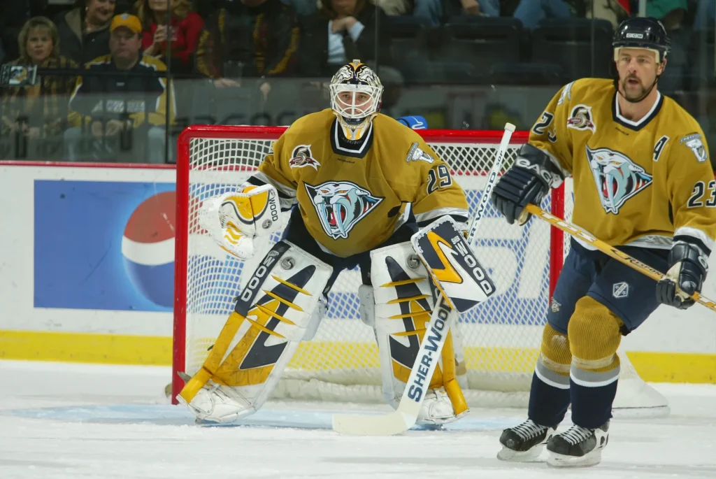
4. Nashville Predators 2001-07 Third
Probably the most questionable jersey on this list, but something about the Predators mustard yellow alternate jersey makes it stand out. This was the first jersey for the Predators that did not contain their primary logo and I’d say this is a pretty good secondary logo. The shoulder logo of a skeleton of a saber tooth tiger is very unique and really could have been the logo on the center of the sweater.
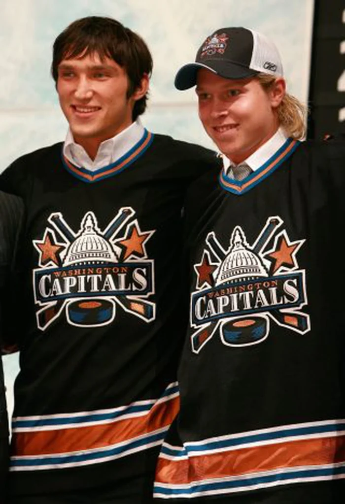
3. Washington Capitals 1997-07 Third
When you think of Washington DC the first thing on most people’s minds is that it is the capital of the U.S. So what better way to represent the capital city with an image of the capital building on the front of the city’s NHL team’s jersey. The Capitals introduced their black third strip two years after changing the logo and colors of the team from red, white, and royal blue with the word ‘Capitals’ as the logo to black, bronze, and a light blue with an eagle as the logo. I think this was a very good upgrade and was sad it only ended up lasting 12 years. The white of the capitol building goes well with the bronze stars that seem to fly on either side.
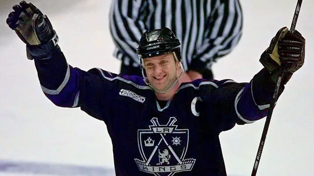
2. Los Angeles Kings 1998-02 Away
The departure of Wayne Gretzky in 1996 coincided with the end of the black and silver era of Kings hockey. With the end of the black and silver, the color purple that was previously used on Kings’ jerseys in the 1970s and 80s was reintroduced. In 1998 a new set of jerseys was released and the black away jersey with purple trim was introduced. This jersey is one of my favorites due to the logo on the sweater that looks like a royal family coat of arms. The logo is completely encompassing of the Kings with a sun, crown, and lion all displayed on a shield lined with hockey sticks. The use of black and purple go well together and makes the logo pop. The only downside to the jersey is the words “Los Angeles” that takes up the bottom of the jersey. It is not terrible, but a solid purple trim without the lettering would have made for a much cleaner look.
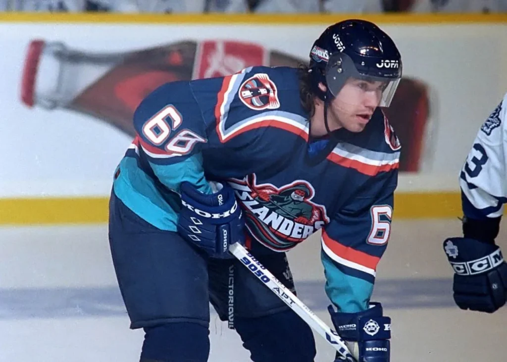
1. New York Islanders 1995-97 Away
The ‘Fisherman’ jersey is one that is either loved or hated. I for one love it. Everything from the colors to the wavy pattern to the angry fisherman gracing the front is great. It is a big difference from the blue and orange jerseys that the Islanders had since their start in 1972. The color scheme of teal, orange, and a darker blue really seemed to fit together. One other detail that helps make these jerseys is the lighthouse on the shoulders. It stands out and is a good representation of life by the sea. When the ‘Reverse Retros’ idea was announced this was the jersey I was hoping for the Islanders to bring back.
With there being some very good past NHL jerseys, currently there are still a handful of NHL jerseys or parts of the uniform that should be removed and never be brought back.
The Los Angeles Kings and Vegas Golden Knights metallic helmets
I am still not sure which one is worse: the metallic gold of Vegas or the chrome silver bucket of the Kings. The Vegas helmet is extremely bright and rather distracting when watching Golden Knights games. The Kings look like they took a mirror off the wall and stuck it on their heads. These helmets are just not a good look and I really hope no one else hops on the bandwagon.
Nashville Predators Stadium Series jersey
Smashville deserves to be celebrated, but this is not the way to do it. With the word taking up a very large portion of the front of the jersey it is hard to look at and even harder to even notice the guitar pick logo in the middle. Fortunately, these will only be worn for the Stadium Series game against the Tampa Bay Lightning on February 26.
New Jersey Devils new alternate jerseys
I thought these would grow on me but they just haven’t so far. There is a slight red trim, but overall the black and white is very underwhelming. The sleeves look like they have a barcode on them. Not quite the worst jersey in the league this year (thanks Nashville) but still worth being thrown aside.
Vendetta Sports Media is sponsored by Monkey Knife Fight, the fastest-growing DFS site in the industry. MKF’s unique style and gameplay make betting fun and easy. Use our promo code ‘VENDETTA’ or use the link below to get a 100% instant match on any deposit and let them know that we sent you!
Signup now!
Check out the Vendetta Twitch!!
SUBSCRIBE to the Vendetta YouTube!!

SoxProspects: Proudly Begging for Donations Since 2003; Still Too Scared to Talk to Me “Be curious, not judgmental” – Ted Lasso. That show, Ted Lasso, just brings so many life…

Will Clark Blows Up Boston Media’s Anti-Devers Narrative: Calls WEEI’s Will Flemming a Liar on the Record On Boston’s WEEI radio station Monday, Will Fleming said: “Will Clark was there…
Jason McIntyre believes Deandre Ayton is in the ‘class’ of Nikola Jokic, Giannis Antetokounmpo Everyone on the planet knew that the Los Angeles Lakers were not only in desperate need…
(202)
(29)
(1616)
(518)
(957)
(180)
(196)
(999)
(2952)
(4485)
(8605)
(2204)
(2168)
(25)
(797)
(1193)
(1175)
(1022)
(1228)
(28)
(327)