Under Maintenance
We deeply apologize for interrupting your reading but Vendetta is currently undergoing some important maintenance! You may experience some layout shifts, slow loading times and dififculties in navigating.
This has been a good year for football kits. I have loved some of the shirts but some have been horrific (looking at you Puma). With that being said, here are the best and worst kits of the 2021-22 season that have been released thus far:
Oh, this is gorgeous. The cream, the green, the splash of orange on the Liverpool crest and swoosh – Nike truly hit it out of the park on this one. The Portland brand went away from the traditional red, yellow, and black of yesterday’s Liverpool kits and did so in a good way. This away kit is a nod to the 90s and Jurgen Klopp’s squad will be looking to capture some of the luck their collared shirts held in past seasons.
Pink on a kit can go one of two ways: terrifically or horrifically. Safe to say PSG’s away kit reflects the former. While it may not be better than the purple, pink, and black Jordan kit of last year, this kit is subtle and elegant – it does a lot by doing fairly little. The shirt is a simple black stripe down the center with a blacked-out PSG crest and a bolder pink rectangle adjacent to the black stripes. This is another example of how a proper sponsor can elevate a kit. Fabulous shirt, slap a “Messi” and No. 30 on the back and I will be in love.
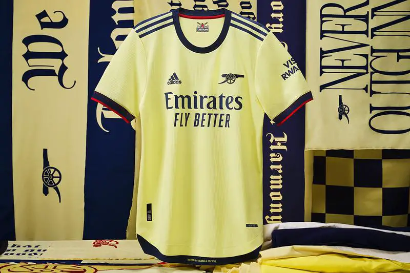
It pains me to include an Arsenal kit on the list, but I have to do it. The yellow, the navy, and the simplicity of the shirt combine to make it right up my alley, and the Gunners’ cannon logo as the crest is amazing. Again, having the right sponsor completes the shirt of this kit.
Every Ajax kit is phenomenal. The home kit is a classic, the away kit is bold and the third kit is, well, exquisite.
The home kit: Adidas went back to the classics here and they did not disappoint. The classic Ajax logo nods to the great history of the club. The grey stripes are a nice touch and the white and red jersey is awesome as always.
The away kit: This kit could have gone horribly wrong but it went so, so well. It may be a bit too bright for some people, but I love it. The blue is just the right shade and the teal/turquoise shoulder stripes are an awesome touch.
The third kit: “Don’t worry ’bout a thing. ‘Cause every little thing, gonna be alright.” Beauty in simplicity, this kit is just immaculate. I love a base black kit. The legend of both Bob Marley and Ajax certainly takes this shirt up another level and the subtle details of red, yellow, and green stripes along with the three birds on the back of the collar have me telling the Three Stripes brand to take my money.
Best kit on this list, hands down. That the club let their fans design the shirt makes it even better, and I love that the intricate outline and geopolitical breakdown of Brazil take up most of the shirt. I need this kit.
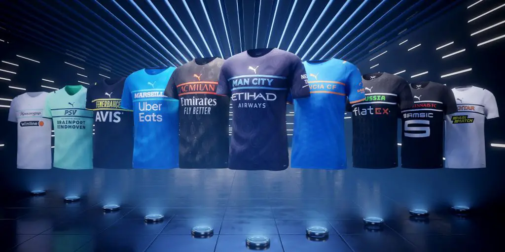
These are hideous. I have experienced great disappointment from Nike regarding Chelsea kits, but I got second-hand embarrassment from seeing the mess Puma created with these shirts. The German athletic retail brand did not do well here. These jerseys look like training t-shirts that mascots shoot from air cannons. They look like the free shirts they leave hanging on the backs of stadium seats. These kits are so bad, DHgate will not even make knockoff versions. This just seems lazy. I am genuinely convinced that I, Alex Cervantes, a journalism major without a single ounce of artistic talent, could put a sketch together in less than 30 minutes that would be better than these 10 shirts. Oh and then, of course, this:
The person that tweeted this is lying. This jersey is not it. You have such a classic in the navy blue and red vertical stripes and yet you divert from that tradition. Why, Nike, why? I really do not have much else to say about this.
It looks like cotton candy and a My Little Pony glitter bomb exploded on an Adidas kit. This is garbage, nothing else to say. Honestly, my eyes are strained by even looking at these.
I was unaware that teams could make a kit by using a Sharpie highlighter, but here we are. Again, my eyes are strained. This jersey is lazy, boring, way too bright, and just sucks.
This was a colossal failure. The odd shapes and stripes do not make this any better. The bottom sponsor is ugly and the yellow, blue, and white just do not go well together.
That rounds out the best and the worst of the 2021-22 kits this season. Nike and Adidas both had their fair share of highs and lows, but what I hope the world learned is that Ajax has the best kits in Europe.
***
Vendetta Sports Media is sponsored by Monkey Knife Fight, the fastest growing DFS site in the industry. MKF’s unique style and gameplay make betting fun and easy. Use our promo code ‘VENDETTA’ or use the link below to get a 100% instant match on any deposit and let them know that we sent you!
Signup now!
Check out the Vendetta Twitch!!
SUBSCRIBE to the Vendetta YouTube!!