Under Maintenance
We deeply apologize for interrupting your reading but Vendetta is currently undergoing some important maintenance! You may experience some layout shifts, slow loading times and dififculties in navigating.
It’s a little late, sure, but Euro 2020(1) is finally here!
Here at Vendetta we’ve got you covered for all the actual football, but for all the slippery dribbling, elastic saves, Cruyff turns and Thunderbastards, there’s an oft overlooked factor to discuss when evaluating ones enjoyment of the game: the strip.
Two timeless uniforms can make great game a classic. Think of the visual delight of the World Cup semi final in 1998, where Brazil and the Netherlands played out a brilliant match, made all the better visually by two of the most distinctive and beloved shirts in world football.
So let’s run our eyes over the shirts that the combatants at Euro 2020(1) will don. For the sake of this piece, we’re sticking to home kits only. Why? Because away kits are often where imagination goes to die. Either that or they’re the drug induced fever dream of a bored and very much stoned designer.
So let’s get amongst it. Vendetta’s Euro 2020(1) home kits, ranked from worst to first.
24. Portugal
A shirt that is, frankly, boring. Sometimes, simple can be beautiful. Not on this occasion. Nothing really works, here. It looks like a knock-off golf polo. And the colour! Portugal usually sport a beautiful, deep red. This strip is just too red. Whisper it, but it’s almost Spanish. If you wear the colour of the enemy, you can’t be anything other than last on this list.
23. Czech Republic
So much red. A lovely shade of red, to be fair, but there’s just so much red and so little else. Too boring.
22. Belgium
This shirt certainly isn’t boring, which is a most cardinal of sins. If anything, it’s a little too busy. It looks as though a really tiny car – possibly one containing a small army of clowns – has gone screeching over the front of it. Points have been deducted for wasting such a gorgeous retro badge on such a rotten shirt.
21. Russia
This kit has been modified since the original tournament start date; the collar and cuffs altered from blue and white, to a single solid white. It was apparently done to avoid confusion with the Serbian home kit. Of course, the Serbs have since taken the blue from their cuffs and collar, in what can only be seen as an act of aggression, retaliable by war. Oh, yeah – the Russian strip. Sorry. The white collar/cuffs are inconceivably wide. It’s almost like they need a second colour to break it up a touch. Some blue, perhaps?

20. Austria
It’s just a shit Arsenal kit, isn’t it.
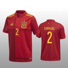
19. Spain
A classic Spain kit, ruined by what it can only be assumed is a printing error. The black lines that run down the right breast and across the shirt capture the eye, if only to make you ask ‘What the hell is that?’.
18. Scotland
Scotland’s first representatives in a major tournament since the Neolithic era will step out in….blue hoops? This design is something that can only be explained away as a peace offering between Glasgow giants Celtic and Rangers; something to bring the fans together behind a common cause. Usually when Celtic and Rangers fans are brought together, that common cause is to beat the snot out of each other.

17. Germany
Speaking of hoops….
Why, dear reader, does the German home top have hoops? Unlike the Scotland strip, these are of the pinstripe variety, but are no less incongruous to what is usually a shirt that typifies the German stereotype: unfussed, efficient, practical. Like laughter, flourishes on football kits doesn’t suit the Germans.

16. England
Football may or may not come home in Euro 2020(1). What isn’t coming home is Vendetta’s Best Dressed award. England’s traditional white with dark blue trim doesn’t leave too much room to maneuvere. The Three Lions crest sits proudly mid chest – a mid chest crest always looks good. Aside from some cool looking numbering, this is a pretty bland effort. Nike didn’t have much to work with to be fair.

15. Ukraine
If Serbia don’t goad the Russians into starting World War III, then maybe the Ukrainians can, thanks to a cheeky political statement hidden in the Ukrainian shirt: the disputed Crimean peninsula in a silhouette of their country included in the shirt. (It’s that little bit jutting out on the bottom right of the silhouette) We don’t need politics in football, folks. Especially a tournament that will be played between political entities that are separated by a set of politically defined borders.
14. Hungary
There’s something about a green and white trim on a red shirt that really takes the eye. In this kit, it’s made all the better for the horizontal, but slightly asymmetrical two tone effect. According to manufacturer Adidas, it’s meant to represent the Danube river. Apparently.
13. Switzerland
This generic effort probably deserves to be lower down these rankings, but this writer couldn’t resist the bottom-of-the-barrel-gag of putting the Swiss right in the middle. The horizontal lines are a nice touch. Mildly eye catching but nonetheless unobtrusive.
12. Netherlands
This, folks, is how to ruin a classic. Brazil aside, the Dutch possess perhaps the most instantly recognisable shirt in the football world. If you switch on a TV and see that orange shirt, you instantly know it’s De Oranje Zomer. For Euro 2020(1), the Netherlands have chosen to sully their famed threads with what looks like the outlines of a ‘colour by numbers’ version of the Dutch lion, only every every panel number is 1: Orange.
11. Poland
Poland’s home top is white, the traditional realm of the bland away top. In that sense, it’s difficult to do too much with it. So rather than do too much, this strip is kept simple and effective. The crest is proud and prominent in the centre of the chest. Unlike England, Poland decide to put their numbers on the left breast. And those numbers might be the best looking numbers in the whole of Euro 2020(1). They’re so good they’ve moved the Poles up a few notches on this…umm…poll.

10. Slovakia
Remember those fever dreams mentioned in the intro? This is one of those.
Slovakia have abandoned their traditional white home strip to embrace the sheer madness of their blue kit. It’s apparently inspired by Slovakia’s mountainous landscape. There’s a fair chance it’s inspired by an acid trip. No matter the inspiration, it’s a great looking shirt.

9. Italy
The Italians almost fall out of the top ten in a fashion competition for the first time in recorded history. They’re only hanging in because the Italians, despite sporting a central defensive partnership that can be aged in eras, will somehow make this kit look great. Rather than the usual solid blue, this Azzuri shirtcontains a busy background pattern that robs the top of it’s gorgeous simplicity. The navy collars don’t help, either. White? Sure. Blue? Definitely! Navy? Eh, cosi cosi.
8. Sweden
You really can’t go wrong with Sweden’s traditional yellow and navy look. The wide, single colour cuffs that stood out for all the wrong reasons on the Russian shirt, make the Swedish top jump off the page. Maybe it’s the fact that the collar is darker than the shirt? The hero of this kit is the navy/blue/navy sleeve cuffs. Delightful!
7. Wales
The Welsh start from a position of strength when it comes to their home kit. A vibrant red, yellow features, and the famed Dragon of Glyndwr on their crest. You can’t really go wrong. Like the Swedish shirt, the sleeve cuffs stand out for all the right reasons. The only thing that could improve this shirt is to feature the dragon more prominently.

6. Croatia
As recognisable a kit as there is in football, the iconic chequered Croatian uniform is, as expected, near the top of this list. The checks seem to have progressively gotten bigger over the years (the smaller ones could strobe on the TV) and there’s not really much room to make them bigger. That said, why would you want to? These are perfect. The Croats do lose points thanks to the 2006 World Cup, when the Australian fans spent 90 minutes chanting (to the tune of the Pet Shop Boys classic Go West) ‘Your shirt! Is a table cloth’. This writer can’t shake the image of a Croatian shirt sitting under the plates at a cosy Parisian eatery.

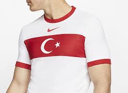
5. Turkey
Turkey are another nation that choose to wear predominantly white as their home kit. Unlike many, they make it look good. The strong red band over the chest both interrupts the otherwise solid white and, importantly, emphasises the Turkish crescent moon and star symbol. This is a simple shirt, but also strong and effective.
4. Denmark
If the Austrian shirt is just a lazy Arsenal rip off, then the Danish shirt is what the Arsenal kit could, nay should be. The chevrons rock. They always rock. A lovely touch this time around is the sound wave pattern built into the body of the shirt, meant to represent the Danish fans that won’t be able to see their team play. Bonus points for the home goalkeeping kit, which is a work of art.
As a Danish manufacturer, Hummel generally only produce the Danish international uniforms these days, and that’s a genuine shame. Their trademark chevrons always work, and they have produced some classic kits over the years.
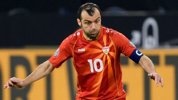
3. North Macedonia
This strip was due to be retired after qualifying for Euro 2020(1), but fan uproar saw the powers that be reinstate this cracker of a kit. The striking sunbeams streaming out from behind the badge make this shirt both beautiful and unique. Despite it’s distinctive flourish, at it’s heart this is a simple design that works so well.
2. France
As always, France produce a wonderful strip. The 2021 kit is a lovely dovetailing of the traditional Mariniere design of recent years via the blue-on-blue hoops and the solid red stripe that sets off the rest of the top a clear nod to 1998 World Cup winning shirt. This is a gorgeous shirt and in any other tournament would likely be a clear winner.

1. Finland
Our winner is a nation making it’s debut in a major tournament.
The Finns home shirt is pure perfection. The basis of it’s design is relatively simple: a solid white with an offset blue cross, similar to their national flag. It’s in the detail where this design truly shines. The fade of the blue cross dominates the stark white behind it. The gold trim is delightful. The badge and numbers – the numbers look great, as well – being offset to the left of the shirt balance out the cross nicely.
The Finns will likely only be around for the group stage, so get yourself an eyeful of this most magnificent kit whilst you can.