
The New Nike MLB City Connect Uniforms Are Horrendous
Nike announced that seven Major League Baseball teams would be releasing new uniforms for some games during the 2021 season and at first, it was a cool concept. Each newly designed jersey represented what the city represents, taking inspiration from history and culture. The teams participating would be the Boston Red Sox, Los Angeles Dodgers, Arizona Diamondbacks, Chicago Cubs, Chicago White Sox, Miami Marlins and the San Francisco Giants. This was however before everyone saw what the jerseys actually looked like.
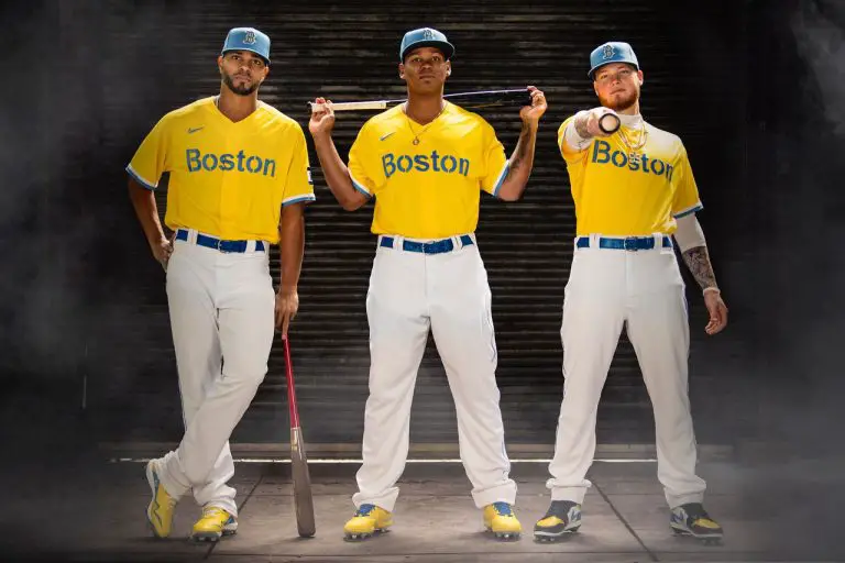
On April 6, the Boston Red Sox were the first to reveal what the jerseys looked like. They looked like yellow raincoats, to say the least. The lettering that said “Boston” was reminiscent of a cheap little league uniform. The hat was blue and yellow and looked much more like the UCLA Bruins logo than the Boston Red Sox’s logo. Players such as outfielder Alex Verdugo, third baseman Rafael Devers and others modeled the clothes, but it didn’t help its appeal.
The one redeeming factor of the jerseys is what they represent for Boston. The coloring is inspired by the Boston Marathon’s finish line’s blue and yellow. A patch is also on the jersey that says “617” which is Boston’s area code. It is an attempt to bring the city together and although it means well, it wasn’t executed well.
This is an attempt by Major League Baseball to cash in on the success of other alternate uniforms for other sports. The National Football League has a color rush. If baseball is trying to get anywhere in the realm of color rush, they’re off to a rocky start. Let’s hope a team like the San Francisco Giants or the Chicago Cubs has a jersey that’s remarkably better than the Red Sox’s one.
SUBSCRIBE TO OUR YOUTUBE CHANNEL
GO AND SUPPORT OUR SPONSOR SIMBULL. THEIR PLATFORM ALLOWS YOU TO INVEST IN YOUR FAVORITE TEAM AND EARN MONEY EVERY TIME THEY WIN. USE PROMO CODE “vendetta” WHEN YOU DEPOSIT.